Twitter / X Card
Tweet-style preview with avatar, body, and attached image.
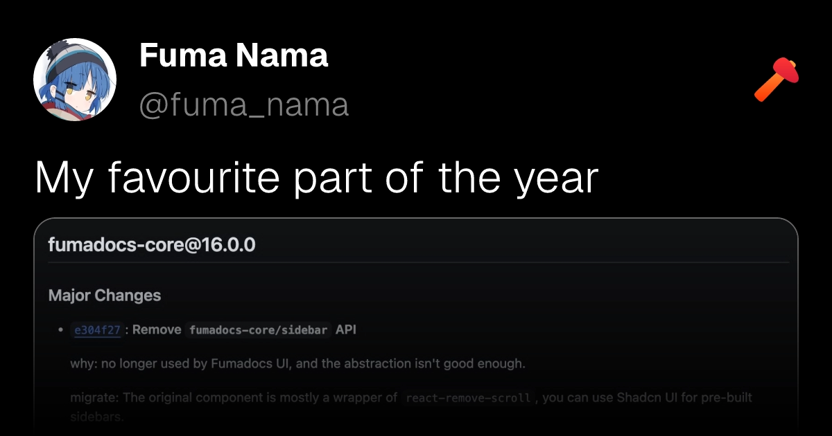
A 1200×630 mimic of an X post. The trick is the bottom gradient overlay — a 50%-tall linear-gradient(to top, black, transparent) positioned absolutely over the image, which fades the attachment into the page chrome without needing a CSS mask.
export default function XPostImage() {
  return (
    <div
      style={{
        display: "flex",
        position: "relative",
        backgroundColor: "black",
        width: "100%",
        height: "100%",
        flexDirection: "column",
        padding: "3rem",
        paddingBottom: 0,
      }}
    >
      <div style={{ display: "flex", marginBottom: "2rem", gap: "2rem", alignItems: "center" }}>
        <img
          src="fuma.jpg"
          alt="Fuma Nama"
          style={{ width: 120, height: 120, borderRadius: "50%" }}
        />
        <div
          style={{
            display: "flex",
            flexDirection: "column",
            fontSize: "3rem",
            flexGrow: 1,
            gap: "0.5rem",
          }}
        >
          <span style={{ color: "white", fontWeight: 700 }}>Fuma Nama</span>
          <span style={{ color: "gray", fontWeight: 300 }}>@fuma_nama</span>
        </div>
        <img src="takumi.svg" alt="Takumi" style={{ width: 64, height: 64 }} />
      </div>

      <span
        style={{
          display: "flex",
          lineClamp: 1,
          textOverflow: "ellipsis",
          fontSize: "4rem",
          color: "white",
          fontWeight: 300,
          marginBottom: "1rem",
        }}
      >
        My favourite part of the year
      </span>

      <div style={{ display: "flex", width: "100%", flexGrow: 1 }}>
        <img
          src="large.jpg"
          alt="content"
          style={{ width: "100%", borderRadius: "2rem", border: "2px solid dimgray" }}
        />
      </div>

      <div
        style={{
          display: "flex",
          position: "absolute",
          width: "100%",
          height: "50%",
          bottom: 0,
          backgroundImage: "linear-gradient(to top, black, transparent)",
        }}
      />
    </div>
  );
}Edit on GitHub
Last updated on