Layout
Flexbox, Grid, Block, Float — what works and what to watch for.
Layout runs on Taffy, the same Rust implementation Dioxus and Bevy use. Flex and Grid are the most production-ready paths; Block works for simple stacks; Float is partial.
Flexbox
The default layout mode for most containers. Use it when the children flow along one axis with optional wrapping.
<div tw="flex items-center justify-between w-full h-full p-12 bg-slate-900 text-white">
  <div tw="flex items-center gap-4">
    <img src="/avatar.png" tw="w-16 h-16 rounded-full" />
    <span tw="text-3xl font-semibold">Takumi</span>
  </div>
  <span tw="text-xl text-slate-400">v1.2</span>
</div>
Supported flex properties: flex-direction, flex-wrap, flex-flow, justify-content,
align-items, align-self, align-content, gap / row-gap / column-gap, flex-grow,
flex-shrink, flex-basis, flex shorthand, order.
Grid
CSS Grid runs end-to-end, including the features most JSX-to-image tools skip — named lines, template areas, repeat tracks, auto-flow.
<div
  style={{
    display: "grid",
    gridTemplateColumns: "200px 1fr 1fr",
    gridTemplateRows: "auto 1fr",
    gridTemplateAreas: `
      "header header header"
      "sidebar main aside"
    `,
    gap: 16,
    height: "100%",
  }}
>
  <div style={{ gridArea: "header" }}>Header</div>
  <div style={{ gridArea: "sidebar" }}>Sidebar</div>
  <div style={{ gridArea: "main" }}>Main</div>
  <div style={{ gridArea: "aside" }}>Aside</div>
</div>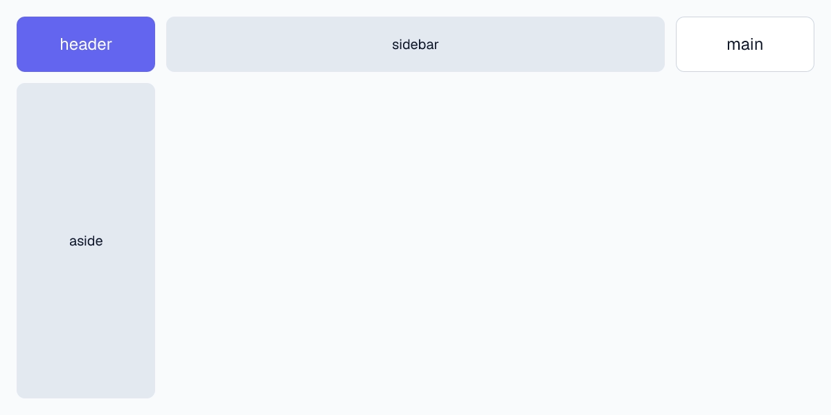
repeat() for symmetric track lists:
<div
  style={{
    display: "grid",
    gridTemplateColumns: "repeat(4, minmax(0, 1fr))",
    gridTemplateRows: "repeat(3, 200px)",
    gap: 12,
  }}
/>
Named lines for explicit placement without counting:
<div
  style={{
    display: "grid",
    gridTemplateColumns: "[full-start] 1fr [content-start] 800px [content-end] 1fr [full-end]",
  }}
>
  <header style={{ gridColumn: "full-start / full-end" }}>Full-bleed header</header>
  <article style={{ gridColumn: "content-start / content-end" }}>Content</article>
</div>
grid-auto-flow to control how implicit tracks fill:
<div
  style={{
    display: "grid",
    gridTemplateColumns: "repeat(3, 1fr)",
    gridAutoFlow: "dense", // pack gaps left by spanning items
    gridAutoRows: 120,
  }}
/>
Block & Float
Block stacks children vertically; each child is full-width by default. Useful for prose-like content where you just want one thing under the next.
<div style={{ display: "block" }}>
  <h1>Title</h1>
  <p>Paragraph</p>
  <p>Another paragraph</p>
</div>
float is partially supported — left and right work for simple wraps around an image, but multi-column flowing text and complex float interactions are not implemented. Reach for Flex or Grid when the layout gets non-trivial.
Common pitfalls
height: auto collapses to content. If a child uses percentage heights, it has no parent to resolve against and ends up zero-height. Either set an explicit parent height or use Flex/Grid to give the child a definite size.
Images need explicit dimensions. Without width and height on <img>, the layout pass measures the intrinsic source — fine for known assets, broken when the source URL fails to fetch (the box becomes zero). Set the dimensions you want and use object-fit to control the fit.
Percentage children require sized parents. width: 50% resolves against the parent's content box. If the parent is itself auto-sized, the percentage has nothing to bind to and falls back to content size.
drawDebugBorder shows what's actually happening. Pass drawDebugBorder: true in render options to overlay layout boxes on the output. Cheapest way to diagnose a layout that's not where you think it is.
Last updated on