Effects
Filters, shadows, transforms, blend modes, and clip paths.
The visual-effects layer of CSS — filter, backdrop-filter, box-shadow, transform, mix-blend-mode, clip-path. Everything here composites at render time, which means the cost shows up as render latency, not bundle size.
Filters
filter runs a chain of GPU-style operations on the node and its descendants.
<img src="/photo.jpg" style={{ filter: "brightness(1.1) contrast(1.2) saturate(1.3)" }} />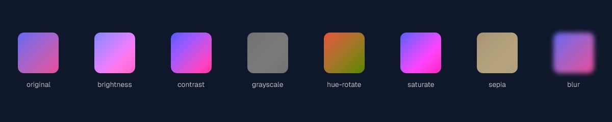
Supported functions: brightness(), contrast(), grayscale(), hue-rotate(), invert(), saturate(), sepia(), blur(), drop-shadow(). Chain by separating with spaces; they apply left to right.
drop-shadow() produces a shape-aware shadow that follows the node's alpha channel — use it on icons and PNGs with transparency. For rectangles, box-shadow is cheaper.
Backdrop filter
backdrop-filter applies the same filter set, but to the pixels behind the node. Classic frosted-glass effect.
<div
  style={{
    backdropFilter: "blur(20px) saturate(180%)",
    background: "rgb(255 255 255 / 0.1)",
    borderRadius: 24,
    padding: 32,
  }}
>
  Frosted glass
</div>
The node needs a semi-transparent background for the backdrop to read; fully opaque hides it.
Box shadow
<div
  style={{
    boxShadow: [
      "0 1px 2px rgb(0 0 0 / 0.08)", // close, sharp
      "0 8px 24px rgb(0 0 0 / 0.12)", // ambient
      "inset 0 0 0 1px rgb(255 255 255 / 0.06)", // inner stroke
    ].join(", "),
  }}
/>
Stack multiple shadows with commas. Each shadow takes offsetX offsetY blur spread color, with optional inset. Multi-shadow stacks are the cheap way to get layered, designer-grade depth without nested wrappers.
Transforms
2D and 3D transforms all work.
<div style={{ transform: "translate(20px, 40px) rotate(15deg) scale(1.1)" }} />
<div style={{ transform: "skew(-8deg, 0)" }} />
<div style={{ transform: "matrix(1, 0.2, -0.2, 1, 0, 0)" }} />

// 3D — perspective on the parent.
<div style={{ perspective: 800 }}>
  <div style={{ transform: "rotateY(25deg) rotateX(10deg)" }}>3D card</div>
</div>
For 3D effects, set perspective on the parent and transform on the child. perspective-origin and transform-style: preserve-3d are honored when you need to nest transformed elements.
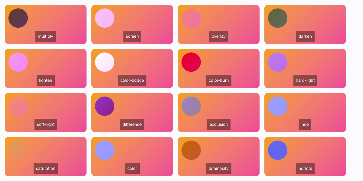
Blend modes
mix-blend-mode controls how a node composites with the layers beneath it. background-blend-mode does the same for stacked background-image layers.
| Mode | Use for |
|---|---|
normal | Default. Source over. |
multiply | Darken; ink-on-paper feel. |
screen | Lighten; light-on-light feel. |
overlay | Multiply + screen based on backdrop L. |
darken | Per-channel min. |
lighten | Per-channel max. |
color-dodge | Brighten backdrop based on source. |
color-burn | Darken backdrop based on source. |
hard-light | Overlay with source/backdrop swapped. |
soft-light | Gentler overlay. |
difference | Absolute channel difference. |
exclusion | Like difference but lower contrast. |
hue | Source hue, backdrop saturation/L. |
saturation | Source saturation, backdrop hue/L. |
color | Source hue/saturation, backdrop L. |
luminosity | Source L, backdrop hue/saturation. |
Clip path
Mask a node to a shape. The non-masked region is fully transparent.
<div style={{ clipPath: "inset(10% 20% 10% 20% round 16px)" }} />
<div style={{ clipPath: "circle(40% at 50% 50%)" }} />
<div style={{ clipPath: "ellipse(60% 40% at 50% 50%)" }} />
<div style={{ clipPath: "polygon(50% 0, 100% 100%, 0 100%)" }} /> // triangle
<div style={{ clipPath: "path('M 0 0 L 100 0 L 100 50 Q 50 100 0 50 Z')" }} />
path() accepts SVG path data, which means anything you can draw in a vector editor you can clip a node to. The clipped node still participates in layout — only the pixels are masked.
Last updated on